08 Feb Elements of a Great Landing Page
A website, like love, is a many-splendored thing. Each page serves a different purpose for your company’s online presence. For example: informational pages, category pages, product/service pages, blog posts and image pages. But landing pages are a somewhat different animal, and can be perplexing. Confusion about their purpose and design can result in an ineffective landing page that costs you traffic to your website, which in turns results in lost leads and conversions – and the subsequent lost revenue. Mastering the art of the landing page is essential in gaining a competitive edge.
What is a landing page, anyway?
As defined by digital marketing entrepreneur Neil Patel, a landing page is typically a standalone page created for a specific campaign, sale or product. It isn’t part of the website’s core framework, but instead exists as a separate destination for a specific purpose. However, as Patel notes, the term “landing page” has become broader over the last few years. For example, your homepage can serve as a landing page – as well as a “features” or “benefits” page. For the sake of this blog post, we’ll define it in terms of a separate page, as this is the most common type.
Of course you know what a landing page is!
If you’re in business, you doubtlessly visit the websites of companies offering products or services that may be of use to you. Many of those sites have a promotion for a free ebook of professional tips or templates that you can download after clicking on the CTA button. If you’ve ever clicked on that button, you were taken to a landing page, which provided more information about the wonderful resource you were about to receive after filling out a form and clicking that CTA button. If you were motivated to click on that button, the landing page was successful!
Elements of a successful landing page
So let’s take a look at the elements that made the landing page you clicked on so compelling:
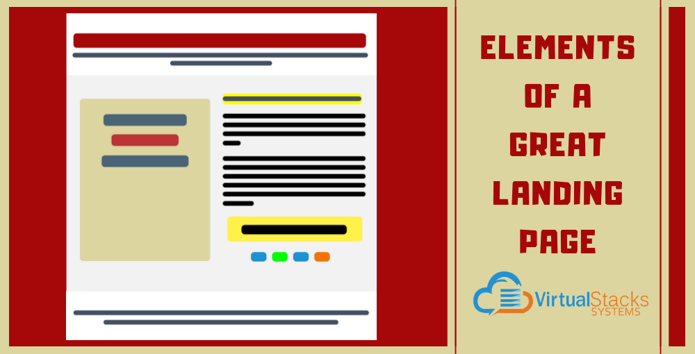
One clear goal – A landing page that converts has a main focus. There is one action the page wants the visitor to take, and every element on that page reinforces it.
![]() Oli Gardner, co-founder of marketing conversion platform Unbounce, provides five elements of a successful landing page, complete with a helpful diagram.
Oli Gardner, co-founder of marketing conversion platform Unbounce, provides five elements of a successful landing page, complete with a helpful diagram.
Toward that end, Gardner’s outline consists of the following:
1- Your unique selling proposition (USP)
• The main headline
• A supporting headline
• A reinforcement statement
• A closing argument
2- The hero shot (images/video showing context of use)
3- The benefits of your offering
• A bullet point list summary of benefits
• Benefit and features in detail
4- Social proof (testimonials, awards, etc.)
5- A single conversion goal — your Call-to-Action (CTA) (with or without a form)
Keywords, main information and CTA are above the fold – People respond to what they see first. A good landing page is laid out so that the most relevant message (including the top half of the form, if there is one) is at the top half of the page. Don’t play hide-and-seek with your message, because visitors aren’t likely to seek.
Identifies the advantages of or improvements to your product/service – This should be self-explanatory, but can get lost, especially if the approval process for the landing page involves several stakeholders who may or may not have a marketing background. Writes Patel, “After all, if a potential customer doesn’t understand what your product or service is about, you’ve lost them. So a straightforward explanation is crucial.”
Features a strong image – Be it an illustration, photo or screenshot, a picture is essential to a landing page that converts. Humans process visual information 60,000 times faster than text, which means you need to choose that image wisely, and present it prominently in the layout.
Reinforces your organization’s credibility – Including customer testimonials and/or prestigious awards (if applicable) are trust signals, and reassures visitors your business is an industry leader or otherwise prominent. For software companies, trust signals also reassure potential customers that your product is ready for market, rather than still in beta.
Works seamlessly on mobile – As covered in our December 21, 2018 blog post, “How to Improve Your Mobile Conversion Rates,” the majority of people visit the web on their mobile phone. Optimizing your landing page for mobile is now a necessity, not just a nice option.
From winners to sinners – elements of an unsuccessful landing page
Just as there are landing page best practices, there are common mistakes that –as Ayat Shukairy observes in her blog post for Invesp – not only fail to convert, but can actually harm your business.
![]()
“While a good landing page is bound to get you a lot of conversions,” Shukairy writes, “an ill-planned landing page will have the exact opposite effect. It will not just lower your chances of getting customers, but also work negatively for the reputation of your business online.”
Deadly landing page sins include:
Multiple messages – Ignore the rule regarding one strong message at your peril. A landing page is not the place to get up as much information about your company and its products/services as possible. You want visitors to take one action, so give them one message.
Cluttered design – Working back to the one-focus rule, Shukairy notes that it is “… vital that your landing page leads the visitor to one goal and not overwhelms him with multiple offers. But the sad news is, about 48% of the landing pages contain multiple offers and call-to-actions. This clutters the entire design of the landing page and confuses the visitor … The cleaner the design is, the better the visitor is able to consume the information you’re offering.”
Links taking visitors to other pages on your website (or, worse yet, another site) – Keep in mind the purpose of a landing page. The visitor takes the desired action of filling out and submitting a form. That’s it. The conversion process continues from there. Providing links to a blog post, YouTube video, etc., is counterproductive. Instead of providing more incentive for a visitor to take the desired action, such links only confuse and distract. A visitor who leaves the landing page for any reason isn’t likely to return.
Social media icons – Again, more distractions. Do you want landing page visitors to look around your Facebook page, or fill out the form and click the CTA button?
Bad CTA button – As our October 12, 2018 blog post, “X Marks the Spot: Create Call-to-Action Buttons That Get Leads” covered, the placement of the button, the shape and color of the button and the message inside the button must be easy to identify and actionable. Buttons that don’t look like buttons and vague messaging won’t get a response.
For example, if your landing page is for a resort timeshare and your goal is to get people to sign up for an introductory tour, the CTA button shouldn’t read “You should be here!” The copy more likely to get a response is “Take a FREE tour!”
Landing page tools that guide the way
Fortunately, many tools are available to make the process easier. Small Business Trends generously provides a list of 15 landing page builders that range in cost from free to a monthly subscription model. There also are many free WordPress page builders available – including pre-made landing pages or add-on templates for purchase.
Of course, creating landing pages that generate leads is just part of website best practices – which include fast loading speed, up-to-date design and functionality that helps boost your conversion rate.
Virtual Stacks Systems offers comprehensive web design services that allow you to reach your company’s goals. Contact us to learn more.