
12 Oct X Marks the Spot: Create Call-to-Action Buttons that Get Leads
X marks the spot on every treasure map you’ve ever seen. Find the X, start digging, and you’ll be rewarded with a chest of gold! Now, replace the X with the call-to-action (CTA) button on your website or landing page. Those who click on it will be rewarded with something you offer that they consider valuable – and you, in turn, will be rewarded with a high conversion rate! Now that you have this image of a treasure map in your mind, think about that X. Your eye is immediately drawn to it, and you’re ready to grab a shovel. Your CTA button should evoke the same reaction. We offer the following best practices in copy, color and layout to help you do just that!
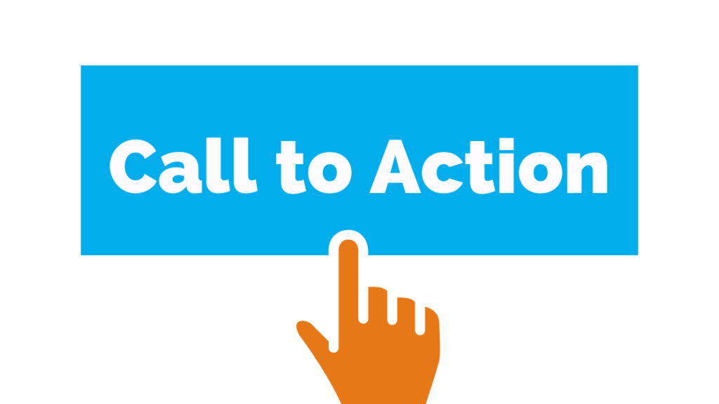
The primary rule is K.I.S.S. – Keep It Simple, Simon (you get the idea – we don’t believe in insulting our readers). David Zheng, Editor in Chief at CrazyEgg, clearly defines what a CTA button is and isn’t.
“The call to action is so important, so essential, and so overwhelmingly powerful that you should not attempt to make yours anything but a button,” he writes. Buttons have a few basic characteristics:
- They have a defined shape or border.
- They have a different color from their surroundings.
- They have text on them.
Zheng’s premise is that a CTA button works best in getting visitors to click on it by being in a familiar rectangular shape, as people are creatures of habit and we’re conditioned to recognize a rectangle as the shape of a CTA button. So there. Trying to be unique will only confuse people and potentially cost you leads.
“As we’ve become accustomed to the online experience, we know that CTAs come in the form of buttons,” Zheng writes. “When we see a button, we know that’s how we take action towards the goal that’s listed on the page. So, to put this in simpler terms: When you use buttons, you make it easy for users to identify where you want them to click.”
You’d think this would be stunningly obvious. Yet Zheng offer examples of landing pages with no clear CTA button. With the visitor not knowing where to look, what to do, or exactly what performing the desired action will accomplish, the chances for conversion greatly diminish.
Which leads to the next point: A good CTA button needs clear, actionable copy inside of that familiar rectangular shape. According to Zheng, copy is the most important aspect in determining whether or not visitors decide to click. “You have a limited amount of space in which to convey to a user why they should click on your button. You need to use that space to tell them exactly what they can expect if they take action.”
Starting with action verbs – such as Start, Join, Build, Learn and Discover – is the basis for strong CTA button copy. Attempts to be clever or creative will likely fall short of visitors clicking the button. For example, if your landing page is for a resort timeshare and your goal is to get people to sign up for an introductory tour, the CTA button shouldn’t read “You should be here!” The copy more likely to get a response is “Take a FREE tour!”
Karisa Egan, account executive and strategist at inbound marketing agency IMPACT, also emphasizes using strong copy. Three of her five best practices for lead-generating CTA buttons involve text:
- Make them action-oriented
- Use persuasive text
- Include strong visuals
- Create a sense of urgency
- Make them easy to find
Egan offers 15 examples of CTA button excellence, from Netflix (number one) to Influenster (number 15). Although the businesses and their websites are very different, the common denominator of their CTA button is impactful elegant simplicity. And while some may believe that CTA buttons are only for landing pages or select web pages, Egan says, “There’s no overstating the importance of featuring a powerful call-to-action on each page of your site.”
Using the right color for your CTA button is also a factor in getting visitors to click on it. The cultural and hard-wired response people have to specific colors can guide you. Digital marketing specialist Peter Geisheker identifies the three best colors as follows:

- Red – Despite its identification with “Stop,” red is a stimulating color that triggers feelings of excitement, urgency and passion. Studies show that it’s the most effective color for CTA buttons.
- Green – This color has a calming effect and is associated with “Go.” It is best suited for products and services relating to the environment, psychology and peace.
- Orange or yellow – Both associated with the sun, these colors are upbeat and stimulating. They promote happiness and urge fast action. Writes Geisheker: “When customers feel happy they will be more likely to buy products that they associate with happiness.”
Geisheker also advises to pay attention to your overall website in choosing the CTA button color to ensure it stands out. “Color palettes vary from website to website but the most important thing to remember is that your call to action buttons should have a healthy contrast from the background of your website. If they do, you will likely see your buttons being clicked far more, which will increase your leads and sales.”
Finally, a CTA button needs logical placement – that is, in the direct visual path of your visitor, at the end of what Zheng identifies as the “read path.” The button should be placed so that clicking it is the next logical step after your visitor reads the last line of text.
He writes: “So as you determine where to place your buttons, keep your readers in mind. Arrange your copy and buttons in a way that encourages a natural reading flow that ultimately directs them to your CTA. When it comes down to it, the goal of placing a CTA button is to put it where the user is going to look next. This isn’t a complex idea – but you might be surprised by how many marketers overlook it.”
That is, place the CTA button at the end of text – not on the side, parallel to the body text. However, this is fairly common practice, as some marketers (and graphic designers) follow the “best practice” of placing the CTA where users will see it as soon as they land on the page. However, Zheng shares the outcome of an A/B test in which a page with the CTA at the bottom of the page resulted in a 304% increase in conversions over the page with the CTA at the top. By making sure your CTA button marks the spot, your business can likewise reap the riches of a high conversion rate!
Of course, fine-tuning your CTA buttons is just part of website best practices – which include fast loading speed, up-to-date design and functionality that helps boost your conversion rate. Virtual Stacks Systems offers comprehensive web design services that allow you to reach your company’s goals. Contact us to learn more.