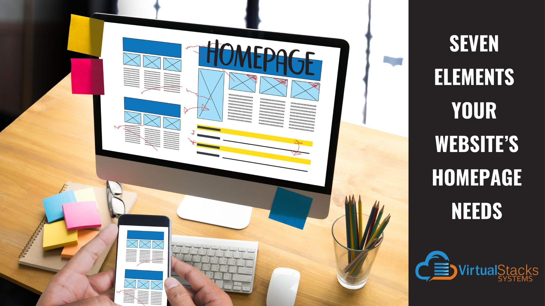
17 Apr Seven Elements Your Website’s Homepage Needs
So you’re planning a website for your small business! Whether you’re going to do-it-yourself or hire a professional website designer (which we hope you will – not just for our own obvious reasons), you need to know some basics. And you can’t get more basic than the homepage! Because this is the first thing visitors will see, it needs to get their attention in a good way, engaging them so they’ll stick around and become customers.
If you’ve been doing your homework, you’ve seen that business website homepages have some elements in common. There’s a good reason for that! Each one serves an important function in your website’s ultimate purpose – generating leads or getting customers in your door. Here are the seven most vital elements your homepage needs.
1. Navigation
This is listed first, because navigation can make or break your homepage – as well as your website as a whole. As Allison Chowdhury writes in her blog post for Name.com, “The navigation bar is one of the highest-trafficked areas of any website, and if you’re not highlighting its most important aspects, your visitors might get frustrated with the experience and abandon your site in favor of something that caters to their needs with more clarity.”
Owing to its importance, the navigation bar is not the place to get creative or cutesy. Give the pages straightforward names, such as About, Products (or Services), Our Team, Resources, Careers, etc. You get the idea. People looking for Products may be confused by what Offerings means, and click off and over to a competitor’s website!
2. Headline and Sub-headline
This is another make-or-break moment, when a visitor quickly decides whether to stay or go. According to Swan Creative, “Your homepage headlines are arguably one of the most important parts of your website. Within 3 seconds, your headline should tell users what your business is offering. Although many visitors at different stages of the buying process might visit your homepage, your headline should target at least a 3rd of your typical audience.
“Your sub-headline should work cohesively with your headline and offer a brief description in greater detail about your service/ product. Using the pain points of your target audience and positioning your product/ service as the solution is often an effective way to capture attention. After reading both your headline and sub-headlines, users should know if they’re in the right place and what you can offer them.”
3. High-quality Images Relevant to Your Business
People are visually oriented. The images you use to represent your business can attract visitors or repel them.
“Images make up a considerable portion of most website’s designs, including homepages,” writes WordPress expert John Hughes for Themeisle. “The images you choose should never be filler – they need to give visitors an idea of what you’re offering them and what your brand stands for.”
These images also need to be high-quality and high-resolution. And here we part company with those who recommend photos of your actual business, products, team members, etc. Truth be told, most small business owners can’t afford a professional photographer, and most of us lack the skill to take professional-looking photos. There’s no shame in that! DIY photos are great for social media posts, however, and give visitors a first-hand, authentic look at your business. But a more polished appearance is necessary for your website. Stock photography can be your best friend in this endeavor. Our blog post, “Why Your Website Should Use Stock Photography” – covers the many advantages that stock photos offer.
4. Highly Readable Typography
In order for visitors to stay on your website and explore it, the typography needs to be easy to read. As with the navigation bar, getting creative in this department is a big mistake! You may think Helvetica or Arial are boring fonts, but they’re popular because most people can read them without effort. Specialty fonts look gimmicky, cheesy and unprofessional – which are negatives you don’t want visitors assuming about your business! Also, keep in mind that not all of your site’s visitors are in their 20s, with perfect eyesight. Point sizes under 12 are hard to read for many people (even with glasses), which prompts them to quickly abandon your site and go elsewhere.
Writes Hughes, “… we recommend you stick to classic designs that are easy to read, and save the funkier styles for your logo and other branding elements. Keep in mind – whichever fonts you use on your homepage will re-appear throughout your site, so pick them carefully!”
5. Overview of Your Business, Services and Features
Visitors need to quickly grasp what your business offers, as well as your competitive advantage. As Swan Creative puts it, “One of the most effective ways to draw users further down the sales funnel is by overviewing your products and services. The majority of users are looking for a solution to a problem they have. Showcasing your products and services overview provides opportunities for further information discovery.”
6. Calls-to-Action
You want visitors to your website to take some specific action, right? Writing for Hubspot, content writer Lindsay Kolowich Cox provides this insight:
“The goal of your homepage is to compel visitors to dig deeper into your website and move them down the funnel. Include two to three calls-to-action above the fold that direct people to different stages of the buying cycle – and place them in spots that are easy to find.
“These CTAs should be visually striking, ideally in a color that contrasts with the color scheme of your homepage while still fitting in with the overall design. Keep the copy brief – no more than five words – and action-oriented, so it compels visitors to click whatever you’re offering. Examples of CTA copy are ‘Sign up,’ ‘Make an appointment,’ or ‘Try it for free.’”
7. Social Media Icons
While you may not think it’s important, the first thing many visitors to your website want to do is check out your social media accounts. Why? Because websites are fairly static. They’re typically not updated unless a new product or service is added. But social media pages are – or should be – updated on a regular basis. Therefore, your Facebook, Instagram, etc., page lets visitors know how active your business is, your current offerings, customer feedback, etc. If they see the last post was several weeks or months ago, it doesn’t reflect well on your business.
On the positive side, a social media page with regular posts and photos of your products, store, services, etc., will boost your credibility, letting potential customers know your business is thriving and they’ll be treated right! Social media icons linking to your accounts will make it easy for them! The best places for visibility are the top of every page, and the footer.
The Take-Home Message and Our Blatant Self-Promotion
To paraphrase the tagline of a popular tire brand, because so much is riding on your website’s homepage, you need to make sure it’s as effective as it can possibly be! But, of course, having the right full-service digital agency on hand can ensure that all is done with optimal expertise.
Our dedicated Virtual Stacks Systems team provides comprehensive digital marketing services that include website design, website redesign, SEO services, content writing, social media marketing, pay-per-click marketing and so much more! We are ready to be your partner in success.
Contact us to learn more and get started!