
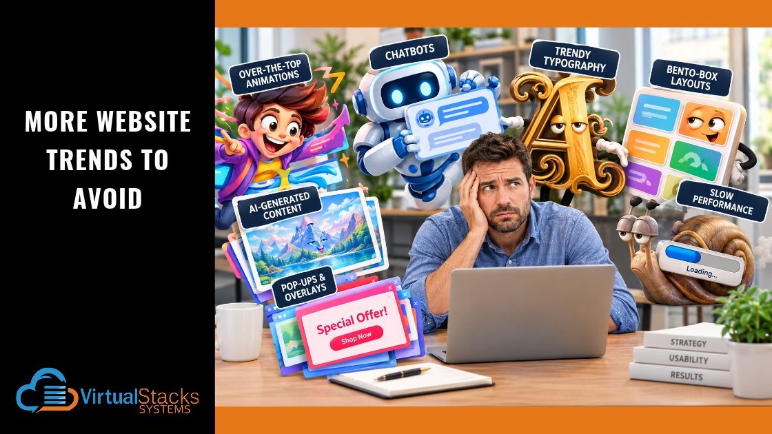
11 Nov More Website Trends to Avoid

Your business website should be one of your most valuable marketing assets. It should make a positive first impression, communicate what you offer, help potential customers find the information they need, and encourage them to take the next step. But web design trends come and go, and not all of them serve these purposes. Some may look impressive in a designer’s portfolio but frustrate visitors, slow down a website, or make it harder for prospective customers to do business with you.
In our earlier blog post — “Website Design Trends to Avoid”— we discussed several design choices that can work against a business’s objectives. Since then, web design has continued to evolve. New technologies and creative approaches offer exciting possibilities, but they also introduce new opportunities to put style ahead of substance.
Here are more website trends to approach with caution when designing or redesigning your business website.
1. Over-the-Top Animations and Scroll Effects
Animations can make a website feel dynamic and modern. A subtle transition when someone clicks a button, for example, can provide useful feedback. A short animation can also help explain a complicated product or process. The problem begins when movement becomes the main attraction.
Some websites animate nearly every element as visitors scroll. Headlines slide into view, photographs expand, text fades in, and graphics move across the screen. Other sites use scroll-triggered effects that appear to take control of the visitor’s scrolling experience. Although these effects may look impressive during a demonstration, they can make ordinary browsing unnecessarily complicated.
Why this trend can backfire:
- Excessive animation can distract visitors from important information and calls to action.
- Complex effects can affect loading performance and responsiveness.
- Unnecessary movement can cause discomfort for some users, including people with vestibular disorders. This is a condition that affects the inner ear or the parts of the brain that process sensory signals for balance and spatial orientation. Symptoms can include blurred vision, trouble tracking objects, or sensitivity to busy visual environments.
- Effects that work well on a desktop may be awkward or unpredictable on mobile devices.
The better approach is to use animation purposefully. If an effect helps visitors understand something, confirms an action, or directs attention to important information, it may be worth keeping. If it exists solely to impress visitors, think twice.
2. Making Visitors Work to Understand What You Do
Minimalist design remains popular, and for good reason. Clean layouts, generous white space, and carefully selected imagery can make a website feel sophisticated. However, minimalism becomes counterproductive when it removes information visitors actually need.
Imagine landing on a company’s homepage and seeing a beautiful photograph, a short slogan, and a single button labeled “Discover.” You might admire the design, but would you know what the company sells, whom it serves, or why you should choose it? If the answers are unclear, the website has a problem. This can happen when designers favor mysterious headlines, abstract imagery, or extremely brief copy in an effort to create an elegant, understated experience.
Why this trend can backfire:
- Visitors may have to hunt for basic information about the company’s products or services.
- Vague headlines fail to communicate the business’s value proposition.
- Search engines may have less useful, relevant content to understand and present in search results.
- Potential customers may leave rather than spend time figuring out what the company offers.
A professional website doesn’t have to explain everything on its homepage. But it should quickly establish what the business does, who it helps, and what visitors should do next. Keep the design uncluttered without making the message obscure. Clear communication is not the enemy of good design.
3. Using AI-Generated Content Without Human Oversight
Artificial intelligence has made it easier than ever to produce website copy, photographs, illustrations, and other visual elements. These tools can help businesses develop ideas, accelerate content creation, and explore different creative directions. But convenience can come at a cost when AI-generated material is published without careful review.
Generic AI copy often relies on familiar phrases and broad claims that could describe almost any business. AI-generated images may look polished while depicting unrealistic products, inaccurate details, or situations that don’t reflect the company’s actual services. The result can be a website that looks professional at first glance but lacks personality, specificity, and credibility.
Why this trend can backfire:
- Generic copy can make a business sound indistinguishable from its competitors.
- Unverified claims can mislead prospective customers.
- Inaccurate imagery can create expectations the business cannot meet.
- Repetitive or unhelpful content may provide little value to visitors or search engines.
AI is a tool, not a substitute for understanding your business and your customers. Use it to support the creative process, but have knowledgeable people review the finished work. Your website should reflect your actual expertise, experience, services, and brand identity. Original insights and genuine examples are far more useful than a collection of generic statements that merely sound convincing.
4. Treating an AI Chatbot as a Must-Have Feature
AI-powered chatbots have become increasingly capable. A well-designed chatbot can answer common questions, guide visitors to relevant resources, and help prospective customers navigate a website. However, installing a chatbot simply because the technology is popular doesn’t necessarily improve the customer experience.
Consider what happens when someone visits a small business website and is immediately greeted by an animated chat window. The visitor hasn’t asked a question, hasn’t had time to explore the site, and may simply want to find a phone number or read about a service. If the chatbot blocks content, repeatedly reappears, or makes it difficult to reach a human, it becomes an obstacle rather than an asset.
Why this trend can backfire:
- Visitors may prefer straightforward navigation or direct access to a real person.
- Poorly configured chatbots can provide irrelevant or inaccurate answers.
- A chatbot that promises capabilities it doesn’t have can undermine trust.
- Collecting information through a chatbot without clear explanations can raise privacy concerns.
Before adding one, consider whether your customers would genuinely benefit from conversational assistance. If they would, make the chatbot easy to dismiss, clearly explain what it can do, and provide a practical alternative when it cannot answer a question. A useful chatbot solves a problem. It shouldn’t create another one.
5. The Bento-Box Layout Everywhere
Inspired by the compartmentalized appearance of a bento box, this design approach organizes content into a grid of cards or tiles. Each section may feature an image, headline, statistic, product, or link. The layout can be an effective way to present several related offerings or summarize complex information. It can also create a polished, contemporary appearance.
The problem is treating the format as a universal solution. When every section is placed inside a separate card, the page can begin to resemble a dashboard rather than a coherent presentation. Too many tiles compete for attention, and visitors may struggle to determine which information matters most.
Why this trend can backfire:
- A crowded grid can overwhelm visitors with competing choices.
- Content divided into small cards may lose its natural flow and context.
- Repetitive layouts can make a brand look generic.
- Important calls to action may get lost among less significant elements.
Use card-based layouts when they help visitors compare options, scan information, or navigate to related content. For longer explanations, service descriptions, and persuasive landing pages, a more natural reading flow may be more effective. The goal isn’t to fit everything into boxes. It’s to organize information in a way that makes sense to the visitor.
6. Designing for Visual Drama Instead of Website Performance
Large photographs, sophisticated effects, custom fonts, embedded videos, and interactive features can all contribute to an attractive website. But each addition can introduce technical demands. When designers keep adding features without considering their combined impact, a website can become slow to load or sluggish to use, particularly on mobile devices and less powerful connections.
A site that looks spectacular once it has fully loaded may not impress someone who leaves before that happens.
Why this trend can backfire:
- Large media files can delay the appearance of important content.
- Excessive scripts and third-party tools can affect responsiveness.
- Late-loading elements can shift the page and disrupt reading.
- A frustrating experience can discourage visitors from completing a form, making a purchase, or contacting the business.
Performance should be part of the design process from the beginning, not an afterthought once the site is complete. Optimize images and video, remove unnecessary scripts, and test the website on real devices. Google’s Core Web Vitals guidance provides useful information about loading performance, responsiveness, and visual stability. Remember, a fast website doesn’t have to be visually boring. It simply needs to deliver its visual experience efficiently.
7. Forcing Visitors Through Pop-Ups and Overlays
Pop-ups aren’t new, but they continue to evolve. Today’s websites may present newsletter sign-ups, promotional offers, cookie notices, chat windows, surveys, and special announcements — sometimes within seconds of a visitor arriving. Each feature may have a legitimate purpose. The trouble is that their combined effect can overwhelm the visitor.
Imagine someone trying to read about your services while a promotional window covers the page, a cookie banner occupies the bottom of the screen, and a chat bubble blocks another corner. Before learning anything about your business, the visitor must start dismissing interruptions.
Why this trend can backfire:
- Pop-ups can obscure the very information visitors came to find.
- Multiple overlays compete for attention and create frustration.
- Aggressive prompts can make a company appear more interested in collecting information than helping customers.
- Intrusive interstitials can interfere with the mobile experience.
Instead, give visitors an opportunity to explore before presenting optional offers. Use pop-ups selectively, make them easy to dismiss, and avoid repeatedly displaying the same message to someone who has already declined it. If a sign-up offer is valuable, explain the benefit clearly. Visitors are more likely to respond positively when the offer is relevant and the timing makes sense.
8. Using Trendy Typography at the Expense of Readability
Expressive typography can give a website a distinctive personality. Oversized headlines, unusual typefaces, and bold text treatments can work especially well for creative businesses and brands with a strong visual identity. But typography should never make visitors struggle to read the content.
Some designs use thin fonts, extremely small text, tightly packed lettering, low-contrast colors, or unconventional spacing to achieve a particular aesthetic. Others use oversized headlines that consume most of the initial screen without communicating much useful information. The result may look fashionable but prove frustrating in everyday use.
Why this trend can backfire:
- Small or thin text can be difficult to read, particularly on mobile devices.
- Low contrast can make important information inaccessible to some visitors.
- Unusual typefaces may slow reading or create inconsistent rendering.
- Oversized headlines can push useful information and calls to action too far down the page.
Choose typography that supports your brand while keeping readability a priority. Establish a clear hierarchy, use comfortable text sizes, maintain sufficient contrast, and check how the design looks on different screens. The best typography draws attention to your message — not away from it.
The Best Website Trend Is a Website That Works for Your Business
It’s easy to get caught up in what’s new in web design. From AI-generated visuals to animated interfaces and sophisticated card layouts, today’s tools offer more creative possibilities than ever. But no single design trend is right for every business.
For example, a creative agency may benefit from an experimental visual approach. A professional services firm may need a more restrained design that communicates expertise and builds trust. An e-commerce website may prioritize product discovery, clear pricing, and a straightforward checkout process. The right choices depend on your audience, your goals, and what visitors need to accomplish.
Before approving a new design feature, ask yourself:
- Does it help visitors understand our business or find relevant information?
- Does it make the website easier to use?
- Will it work well on mobile devices?
- Could it negatively affect accessibility or loading performance?
- Does it reinforce our brand and support our marketing objectives?
If a feature doesn’t provide a meaningful benefit, don’t feel compelled to include it simply because other websites are using it.
At Virtual Stacks Systems, we understand that an effective website is more than an attractive online presence. It should help your business connect with its audience, communicate its value, and turn visitors into customers.
Is your current website helping your business move forward — or holding it back?
Our team can help you evaluate your existing website and determine whether a redesign could improve its appearance, usability, performance, and effectiveness. Contact Virtual Stacks Systems to learn how our website design and redesign services can help you build a website that works for your business — not just one that follows the latest trends. We welcome the opportunity to help you meet your marketing objectives and succeed. Every business is unique, and so are our solutions! We are ready to be your partner in success!